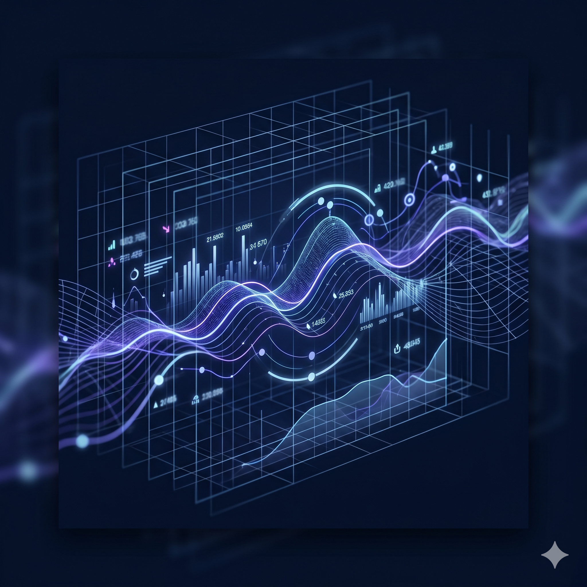
This headline section uses a bold typographic hierarchy — white text on a dark overlay with a gradient accent color for the primary call-to-action phrase, set against a full-bleed particle animation background.
This two-column layout pairs an interactive UI mockup on the left with a value-proposition text block on the right. The floating dashboard visualization with a gradient border uses skeuomorphic depth to signal product maturity, while the right column delivers the core message with a bold typographic treatment and a muted supporting description.
Three illustrated feature cards on a dark grid layout anchor the product's key capabilities. Each card uses an icon-forward layout with a colored glyph, a short heading, and a one-line descriptor.
This card demonstrates an icon + heading + body layout pattern. The icon background uses a translucent warm tone to contrast with the surrounding cold-blue palette, creating natural visual hierarchy within the dark card system.
The second card uses a cool-blue icon treatment to signal trust and enterprise-grade security. Consistent card padding and a shared top-gradient border create visual cohesion across all three cards in the row.
The third card completes the feature trio with a violet icon accent, reinforcing the overall purple-to-cyan brand gradient direction. Cards share identical structure but distinct icon colors to guide scanning behavior.
Up and running in as few as 3 steps — a vertical numbered timeline communicates simplicity and low friction.
Step labels use a dual-element layout: a gradient-filled numbered circle on the left connected by a vertical rule, and an icon container on the right. This double-column step indicator reinforces sequence while adding visual richness.
The connecting vertical line between step numbers fades from purple to transparent, creating a gradient flow that visually leads the eye downward through the onboarding sequence.
The final step omits the continuation line, signaling completion. Icons transition from document to key to play, using visual metaphors that map naturally to the setup-to-launch journey.